Making Plots of Strava Data
A Picture is Worth a Thousand Words
I recently decided to add data visualizations to my Python code on GitHub that analyzes Strava data. For a refresher on how to get it up and running check out my first and second posts about it.
To get started with the figures, create a new StravaAnalyser object :
sa = strava.StravaAnalyzer()
Then make calls to the following three methods with activities and timeframes of your choosing as arguments.
sa.make_combined_pie_chart()
sa.make_seasonal_pie_charts()
sa.make_activity_figures()
The next sections describe the above methods in more detail.
Moving Time Pie Charts
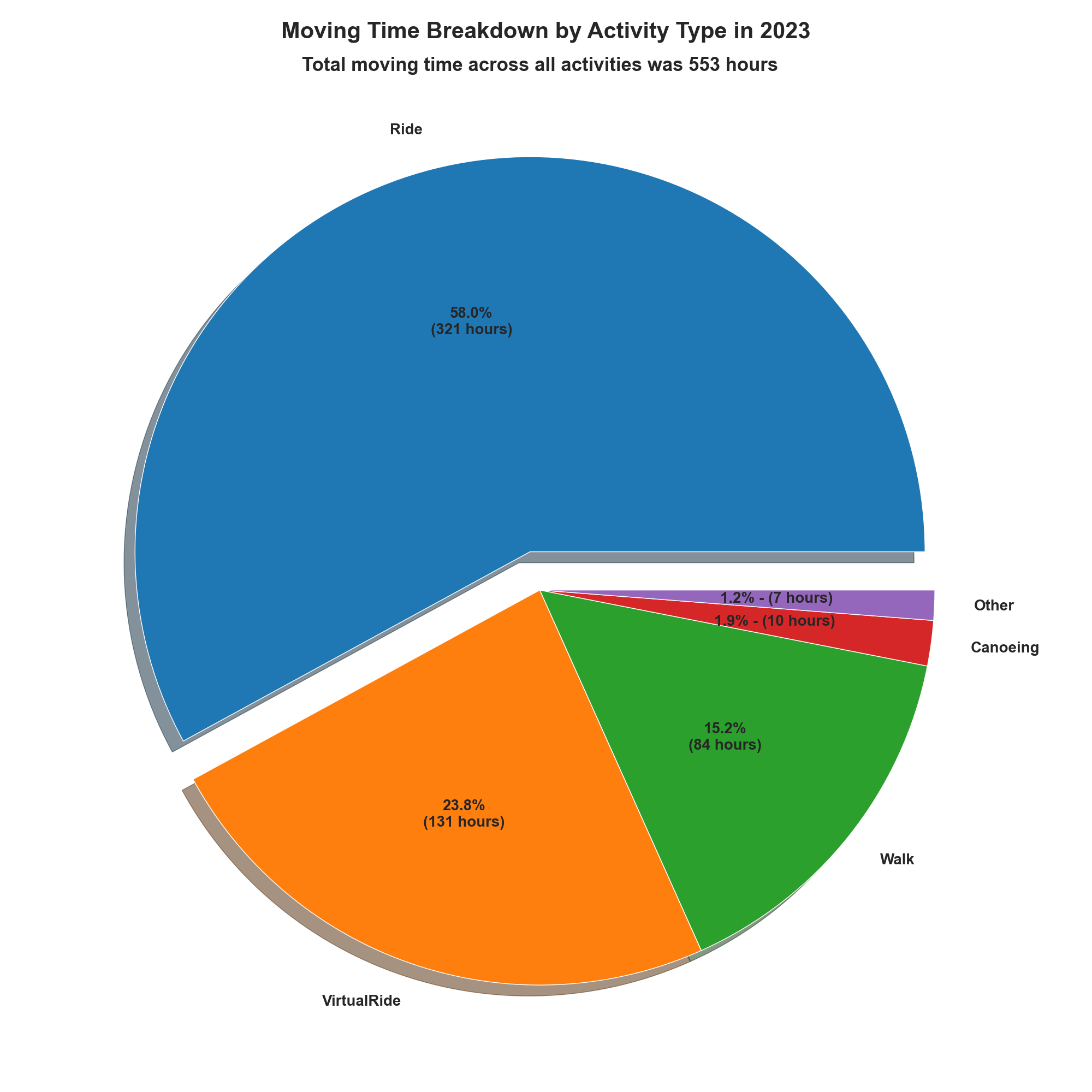
To produce a chart that shows the breakdown of moving time across all of the activities you've recorded on Strava for the year 2023 run:
sa.make_combined_pie_chart(2023)
Here are my results. Given my love of cycling, it's no surprise that cycling and virtual cycling make up the vast majority of my moving time.
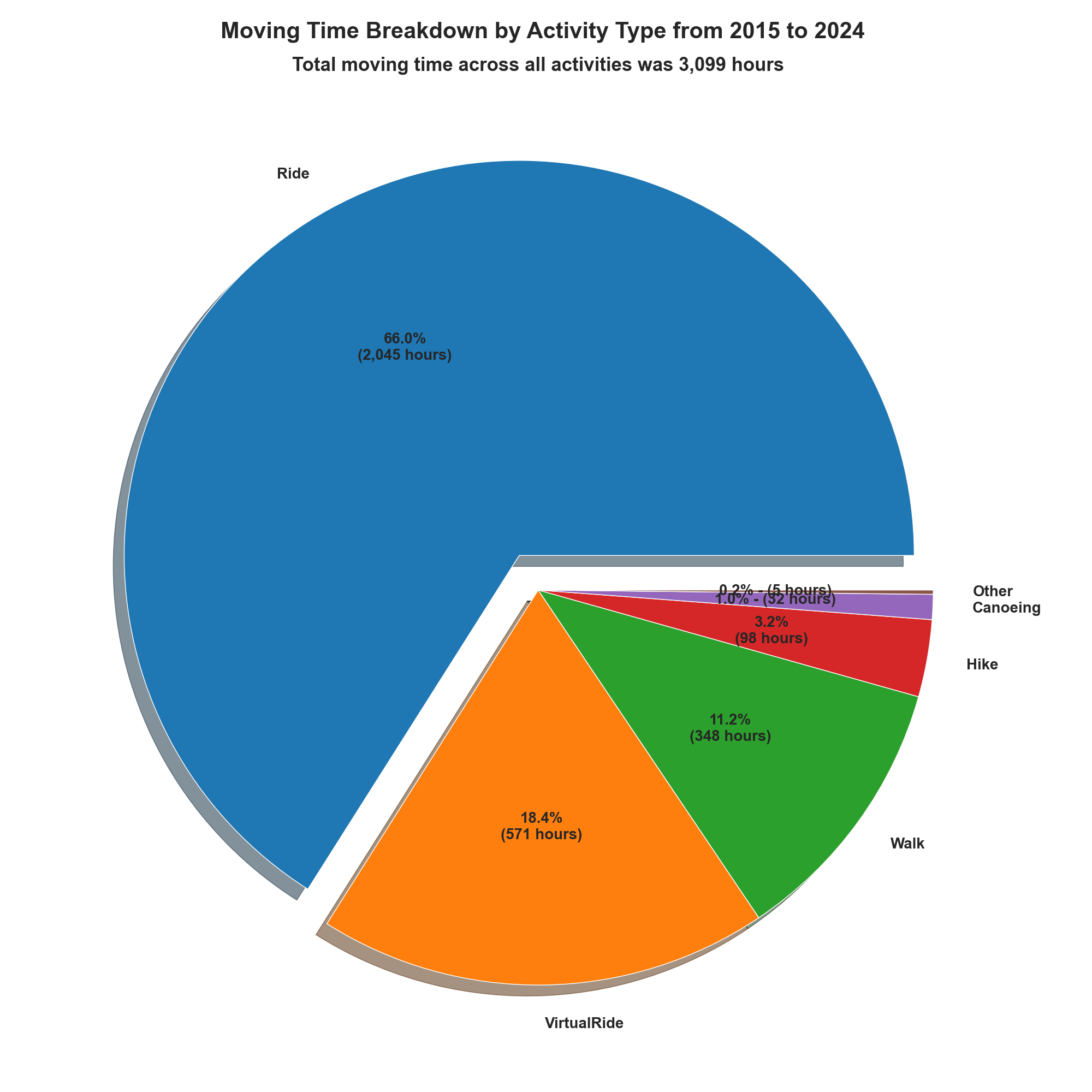
If you want to see the breakdown since you started using Strava, leave the year out.
sa.make_combined_pie_chart()
This is what I get:
Seasonal Pie
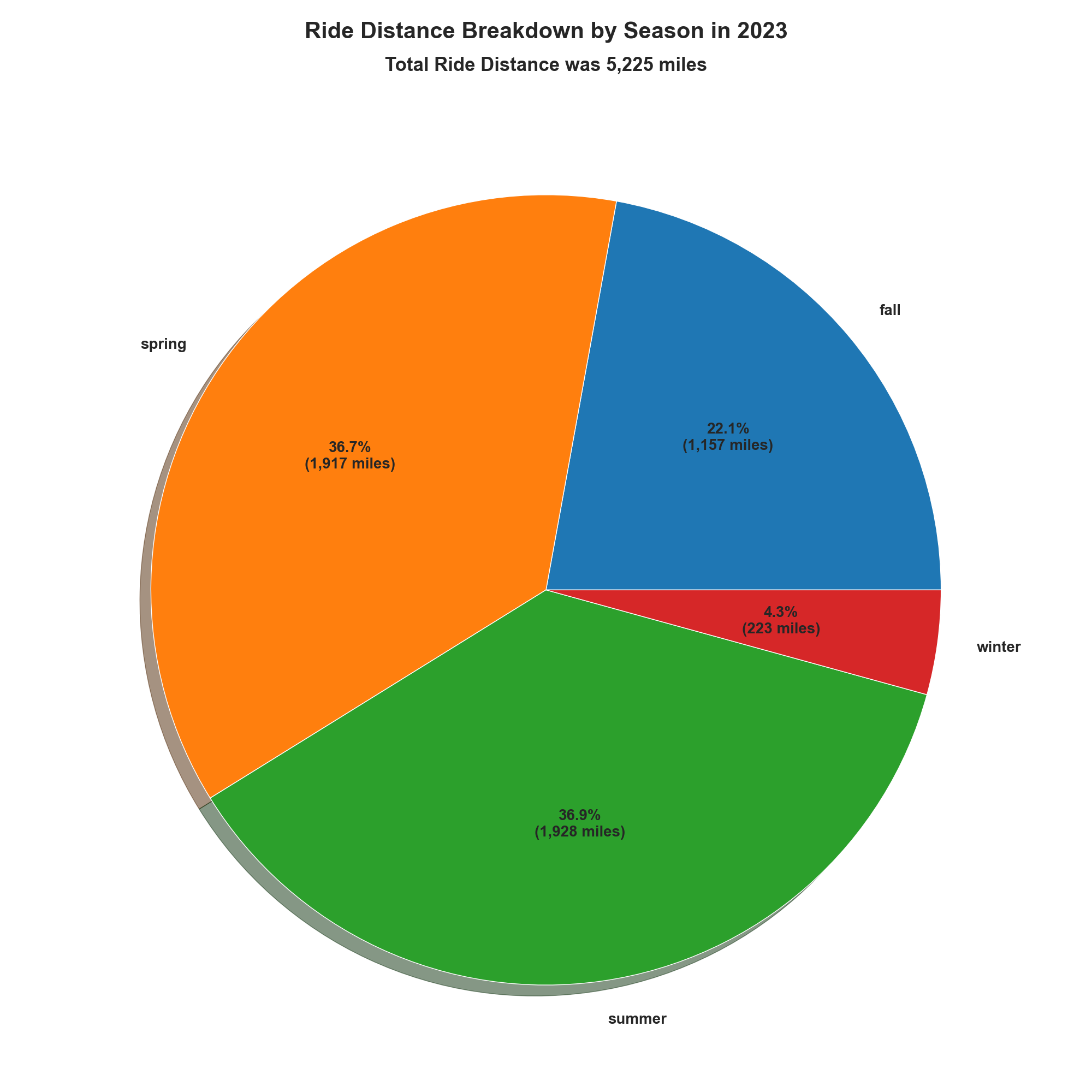
To show how far you rode (walked, ran, etc.) per season or how much elevation gain you climbed per season, use the following command, replacing the activity_type with the Strava activity of your choice. If you prefer metric units, set the metric flag to True.
sa.make_seasonal_pie_charts(activity_type='Ride', metric=False, year=2023)
My cycling distance breakdown by season for 2023 looks like this.
Here's my elevation gain breakdown.
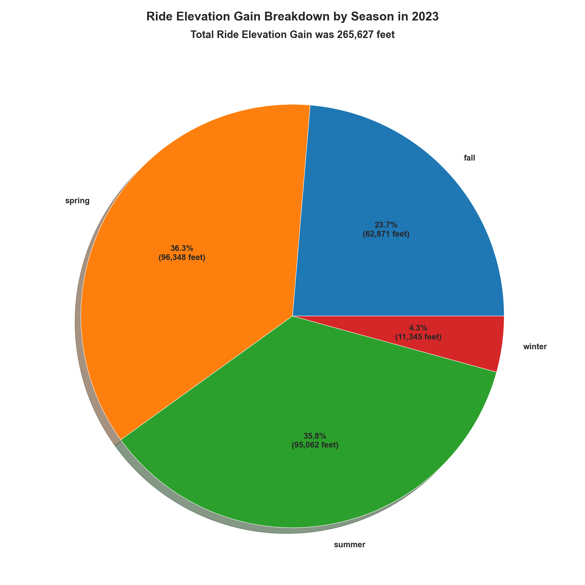
As with the moving time pie charts, you can see the seasonal breakdown for every year you've been on Strava by omitting the year argument in the call to StravaAnalyzer.make_seasonal_pie_charts.
Bar Charts
I like to compare how many miles I've ridden (or hiked, waked, etc.) and how many feet I've climbed across periods of time. StravaAnalyzer.make_activity_figures makes that easy. For each activity in activity_list, the method produces six figures that compare distance and elevation gain across years, months, and seasons. Here's an example method call and some of the figures it produces from my Strava data with increasing granularity.
sa.make_activity_figures(activity_list=['Ride', 'VirtualRide', 'Walk', 'Hike'], metric=False)
This first figure shows how many miles I've ridden each year I've been on Strava.
_bar_by_year.png)
Similarly, here's how many feet of elevation gain I've climbed pear year.
_bar_by_year.png)
The next figure shows my distance information but by season per year.
_bar_by_year_season.png)
My season with the most miles was summer 2021 with 2,545 miles.
Here is the breakdown by month per year.
_bar_by_year_month.png)
So far the most I've ridden in a month is 907 miles which happened in July of 2023.
If the above is too crowded, you can show a subset of years by defining year_list in StravaAnalyzer.make_activity_figures as in:
sa.make_activity_figures(activity_list=['Ride'], year_list=[2020, 2021, 2022, 2023], metric=False)
which produces this chart.
_bar_by_year_month_2020_2021_2022_2023.png)
For brevity I have not included the charts for elevation gain for seasons and months, but StravaAnalyzer.make_activity_figures automatically produces those too.
I'm likely to continue to add visualizations as time permits. For now, feel free to use and modify my code to explore your data on Strava. I'll post updates when/if I add new features.